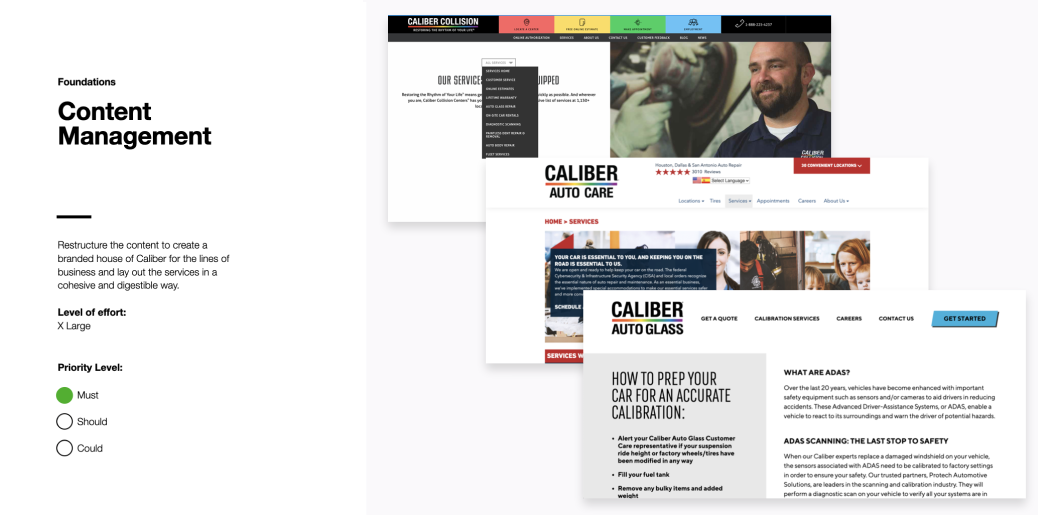
Caliber is a collision repair and auto care company with multiple lines of business — Collision, Auto Care, Auto Glass — each operating its own siloed website. The digital experience was organized around how the business worked, not how customers thought.
The customers themselves were often in crisis. After an accident, dealing with insurance, or facing an unexpected repair, they arrived stressed, unfamiliar with the process, and without the knowledge to evaluate their options. As one stakeholder put it:
The collision business is anything but simple. The website experience needs to be.
Client stakeholder
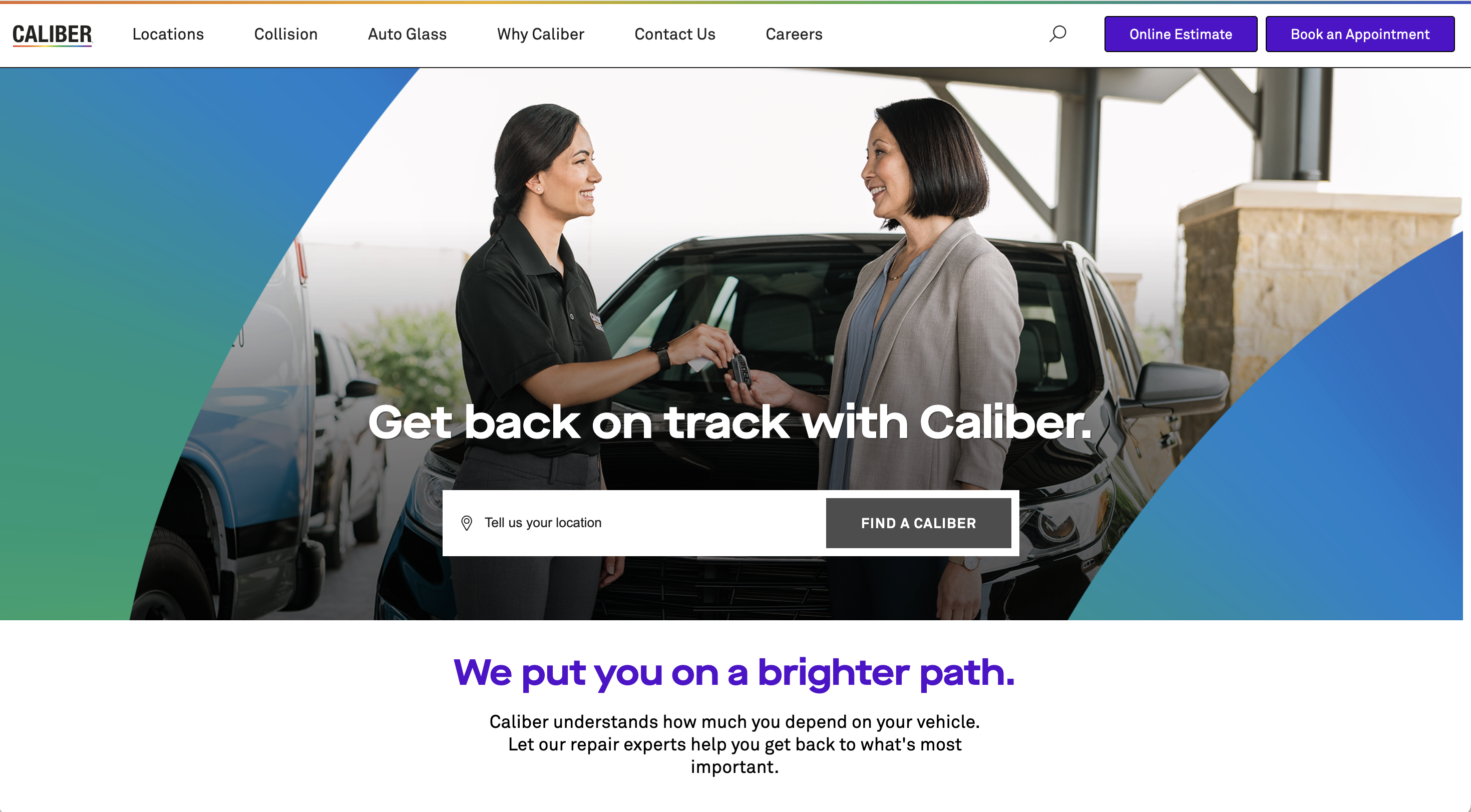
The brief: unify three brands under one digital experience and make Caliber’s services approachable for people who may be having one of the worst days of their week.
The rest of this case study is password-protected.
Before proposing any solutions, I needed to understand the emotional space customers were operating in. Stakeholder interviews and customer research revealed four distinct mindsets that shape how people interact with auto repair services.
This is the emotional space the experience is designed to navigate. Every UX decision responds to it.
These mindsets reframed the entire project. The site wasn’t competing with other shops. It was competing with the instincts and inertia that make people disengage, avoid, or rush through decisions they don’t feel equipped to make.
That understanding surfaced five opportunities — each one a direct response to something customers told us.
The research and opportunities became five principles that would govern every design and content decision going forward. Each one addresses a specific tension in the customer’s experience.
Triage customers down actionable paths, never leave them wondering what to do next.
Customers are visiting the site to get a job done, not be educated or marketed to. Limit extraneous information.
Make every interaction as fast and easy as possible.
Minimize steps and choices whenever possible to reduce cognitive load.
Provide contextual support and interventions to lift barriers and maintain engagement.
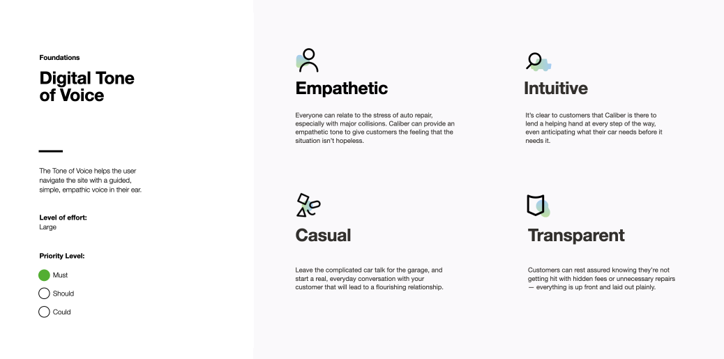
Use empathetic language that makes customers feel seen and heard.
Lead with expertise. Take the burden off the customer of figuring out the right solution.
Create intuitive design systems for seamless wayfinding and handoff across lines of business.
Break down information in easily digestible segments and formats.
Provide a consistent experience that surfaces personalized content and solutions.
Provide clarity to help customers understand their options and make informed decisions.
Offer choice around human engagement vs. tech-led engagement.
Always tell customers what to expect and manage expectations wherever possible.
Be proactive and direct in alerting customers of problems or changes, and tell them why.
Be transparent. No hidden costs, jargon, or fine print.
These weren’t aspirational guidelines. They were decision-making tools: when a design question came up, the principles gave us a clear north star, supported by actionable examples.
With the principles established, the next question was structural. How do you organize a site for someone who is under a lot of stress and has a lot of questions, potentially without any background knowledge or prior experience? The approach we took was to clearly define the primary needs of the customer to create clear pathways and solutions that are navigable even under emotional circumstances.
Customer research identified five primary needs. The architecture had to serve all five, regardless of which line of business the customer ended up in.
Key decisions
- One Caliber, not three. Consolidated the separate LOB sites into a single branded experience. Collision, Auto Care, and Auto Glass became services under one roof, not separate destinations.
- “Get Started” as the universal entry point. A single CTA that branches into location finding, estimates, and scheduling. The customer doesn’t need to know what type of service they need; the flow figures it out with them.
- Services organized by what customers recognize. Navigation structured around service names customers would search for, with a mega menu that makes the full range visible at a glance. Each service links to educational content, reinforcing expertise without requiring the customer to go looking for it.
- Trust built into the structure. “Why Caliber” houses the proof: warranty, repair process, certifications, reviews, community involvement. Not buried in a footer, but given architectural weight as a primary section.
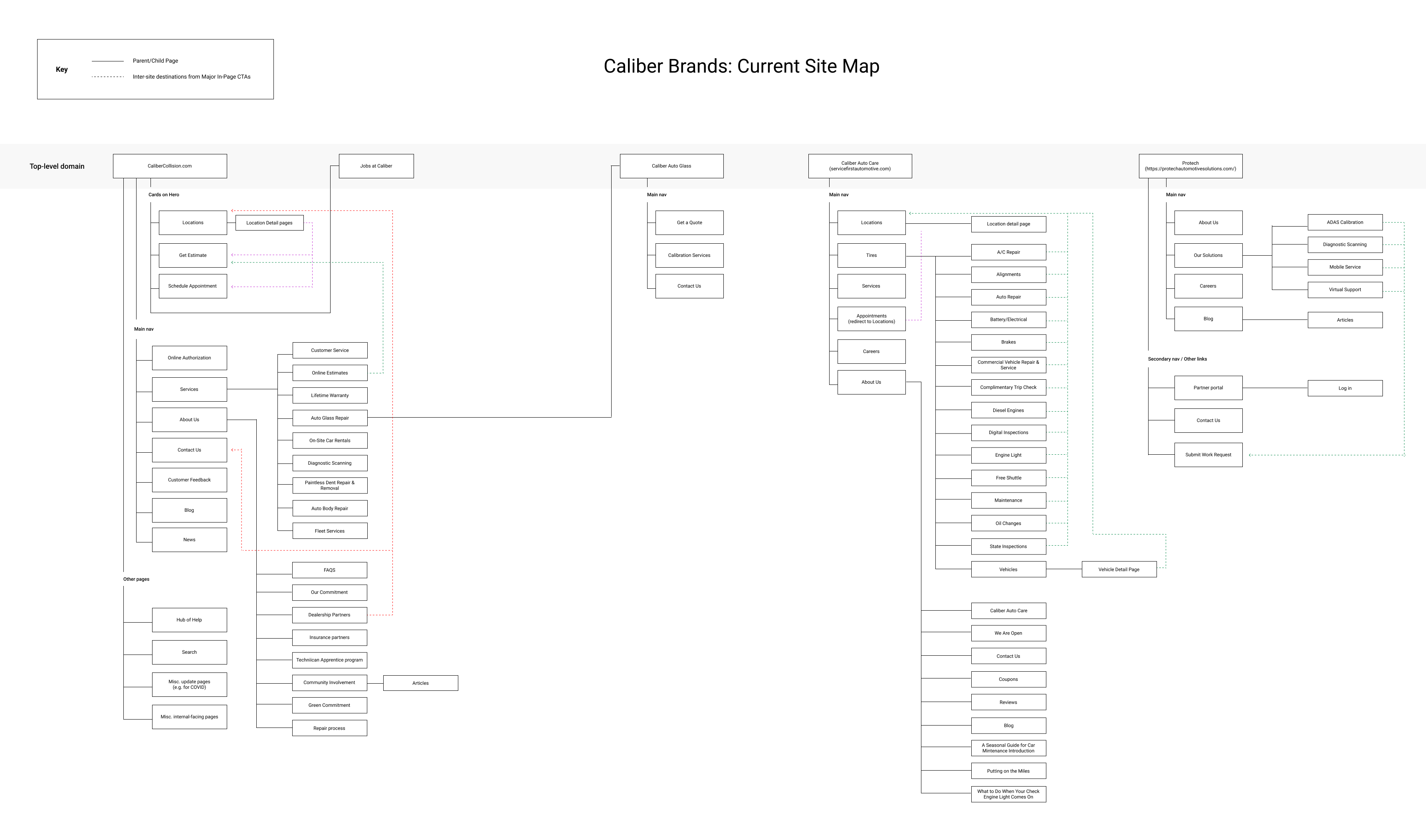
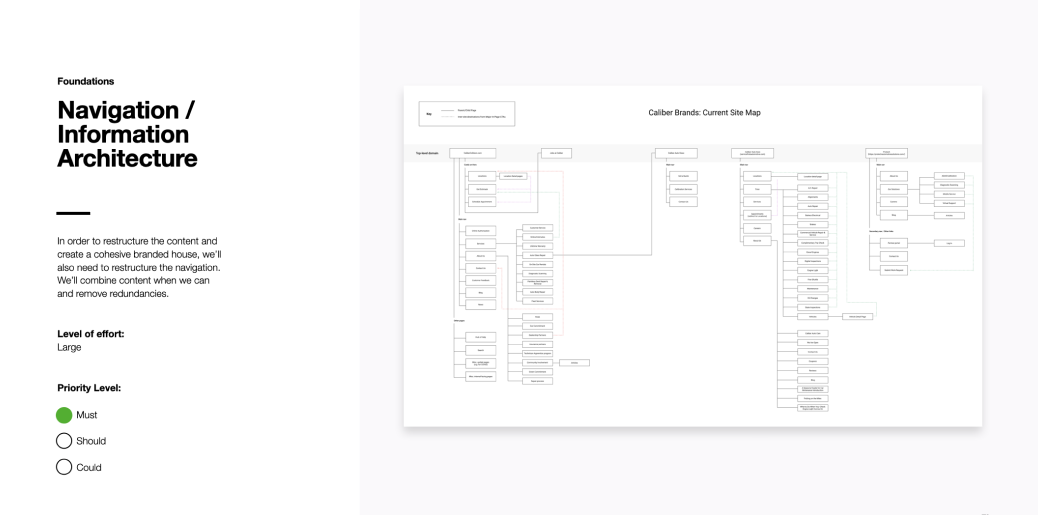
The existing sitemap was spread across several domains and reflected the organizational structure, rather than what the customer really needed.
The customer needs that were surfaced influenced key decisions in the navigation and information architecture of the site that would drive transparency and education while enabling customers to take quick actions.
With a full backlog of recommendations, the team needed a clear way to sequence work against launch scope and business goals. I applied a MoSCoW framework — Must Have, Should Have, Could Have, Won’t Have — to organize deliverables by priority for the initial release.
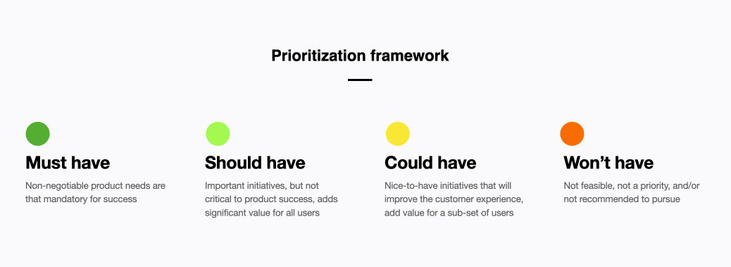
The framework sorted every recommendation into one of four tiers. Must Haves anchored the launch experience: unified navigation, the “Get Started” entry flow, service pages organized by customer need, and location-finding. Should Haves added depth without being launch-blockers. Could Haves and Won’t Haves captured future-phase features and improvements outside the initial scope.
- Unified brand architecture. Three siloed sites consolidated into one Caliber experience, organized around customer needs.
- Research-grounded strategy. Every architectural and design decision traced back to customer mindset research and the five experience principles.
- Complexity made navigable. Flows designed for people in emotional, low-knowledge states, guided step by step with empathy built into the interaction pattern.
I exited this project before final visual design and launch. The work represents strategy, experience principles, information architecture, and navigation design.